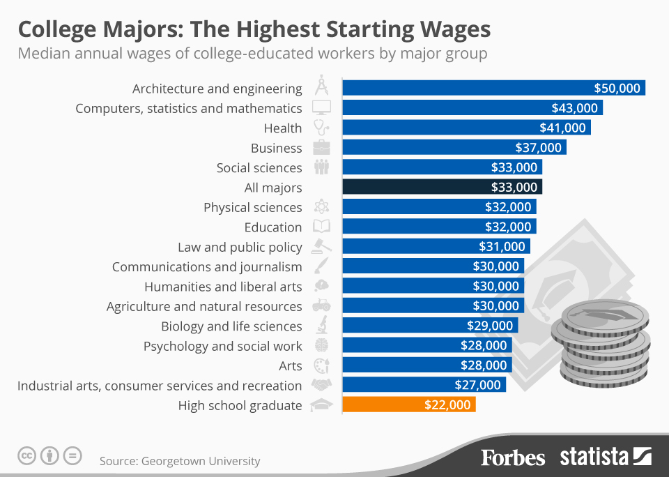
With college being such a large investment, it’s important to have a good idea of how much money you’ll likely be making once you graduate.
Knowing the starting salary of your college major can help you determine your future ability to repay student loans and help you make smart decisions about paying for college.
This infographic from Forbes shows which college majors pay the most–and the least–right out of college.

Applying for financial aid can get confusing.
It can be difficult for families to keep track of all the different types of financial aid available, from grants to student loans.
But this helpful infographic from Southern New Hampshire University makes it a bit easier.
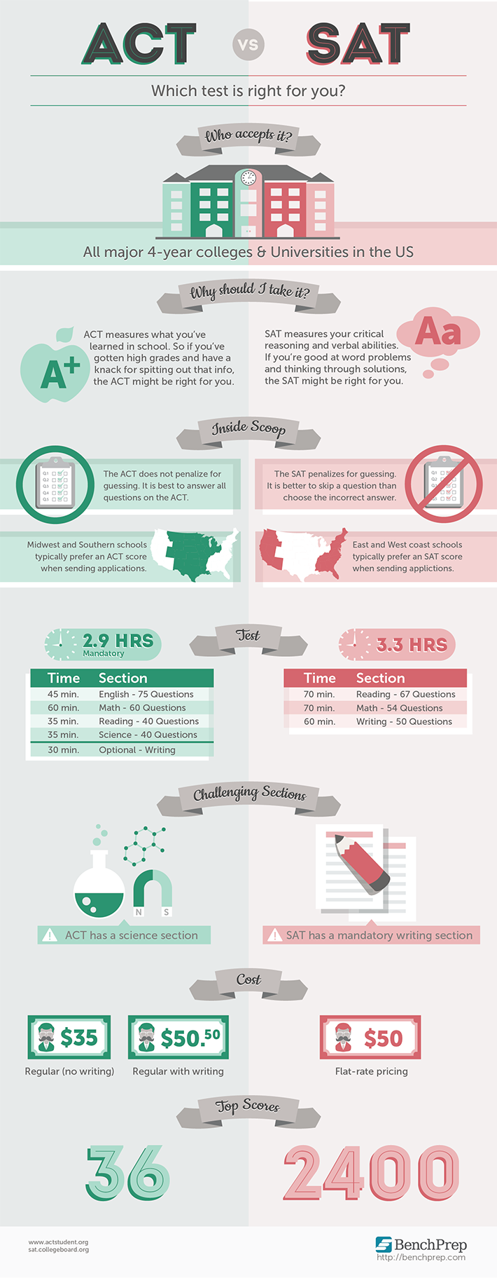
Preparing for college means buckling down and studying for those dreaded standardized tests. But should you take the SAT or ACT?
Some students are better suited for the SAT because it focuses on critical reasoning, while other students benefit from the ACT’s science section.
The best thing you can do is to take both and see where your score falls–you never know which one is better for you until you take the test. Check out this infographic from Bench Prep to figure out which test is best for you.
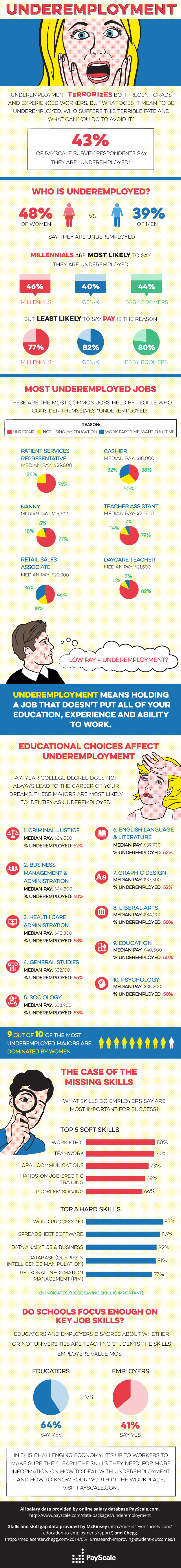
According to a recent PayScale survey, of 68,000 workers, 43% of Americans feel underemployed in their jobs.
As we recently reported, the worker’s choice of college major is a factor in feeling underemployed. Healthcare and Business majors were among the top majors listed by underemployed workers.
This infographic from PayScale presents a broader look at underemployment in America–including the jobs in which workers feel most underemployed and the ‘hard’ and ‘soft’ job skills employers most value.
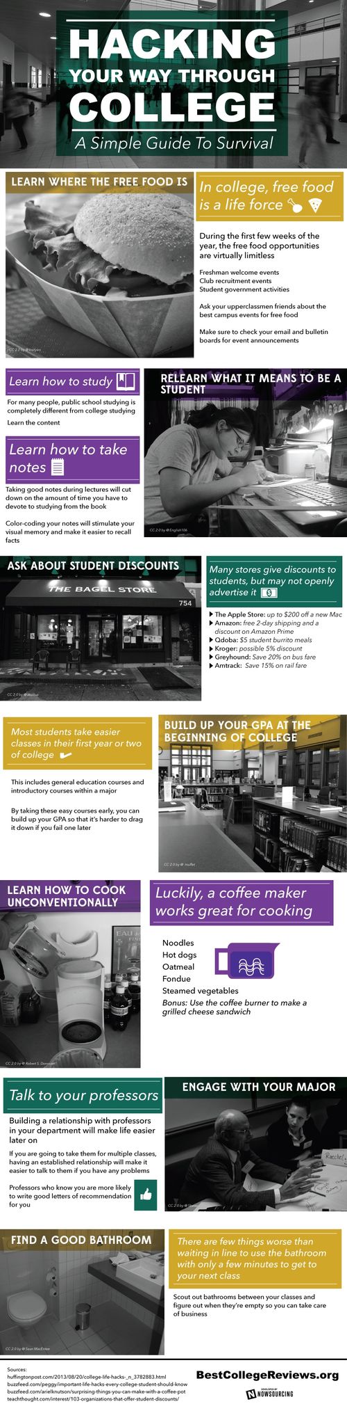
Want to get the most out of college?
This awesome infographic from BestCollegeReviews shows how college students can take advantage of their 4 (or more) years at school, save money, and even find the best bathroom on campus.

Ever wondered how today’s college graduates (and their student loan debt loads) compare to those of previous generations? This infographic from Manilla explores how tuition, college fees, and student loan debt have skyrocketed since today’s graduates’ grandparents went to school. Even adjusting for inflation, the cost of college, particularly at private universities, has gotten out of […]

In his recent trip to nearby Buffalo, Syracuse, and Binghamton, President Obama revealed his new plan to make college more affordable.
This handy infographic from the White House explains the major reforms and initiatives the President hopes to advance in order to hold colleges accountable for providing a quality education, encourage schools to use technology to cut costs, and make it easier for borrowers to repay their student loans.